Whether you’re just getting started out as a business or you’re an established brand that wants to freshen things up, it can’t hurt to invest in a series of business cards. It could be for yourself personally or as part of the bigger picture within the company - but either way, a great business card is always going to help you make a statement.
It’s about presentation, and if you’re presenting yourself as someone who adds real value to your industry, then that can only be a good thing in our book. Alas, while it may seem like a pretty simple practice to get right, it does feel as if people overlook just how much goes into making the perfect business card.
Because of this, we here at Hatchly thought it’d be beneficial to take a look at the ins and outs of this graphic design sub-genre. From getting the size right to finding the perfect finish, there’s a lot to discuss. So, let’s get to it!
When it comes to the perfect business card size, the industry standard is considered to be 85 x 55mm. If you’re picturing a specific card or design in your mind, then we’ll go ahead and guess that it falls into this category.
One of the reasons for this is that they fit perfectly into your pocket, a purse or a wallet, which is where a lot of folks would tend to store one upon receiving it. Of course, there are options that stretch beyond the norm, which is what we’re going to delve into today.

A square business card design is going to serve as a risk, and we may as well say that from the word go. We aren’t suggesting that it’s impossible to get it right; quite the opposite, in fact. What we are suggesting is that you don’t want it to look like a beer coaster, and you instead want it to feature all the key points that you’re trying to get across.
From a practical standpoint, we’d argue this is actually the premium way in which you could get your business logo looking as good as it possibly can. Sure, there are other ways to maximise the space that would also look appealing, but you have to find the right balance and figure out what the priority feature is going to be.

Are mini business cards the best way to go? Well, financially speaking, you’re probably going to save some money in the long run, but you’re also making life a lot harder for yourself when it comes to the design. Naturally, you don’t have as much room to play with, and the thin strip effect can seriously damage the reader’s ability to see exactly what it is you’re trying to sell.
On the flip side, it’s always interesting when you can take a risk in the business world and come out smelling like roses. The mini business card is an idea that feeds into the minimalist ideology, and for a lot of companies, that’s going to be really interesting to explore. It’s creative, it’s different, and you just know it’s going to get people talking.

The landscape business card is the size and shape that the majority of people go for, and you have to wonder whether or not that’s because it’s just “how it’s done”. We’d like to think there’s more to it than that, given how much you can fit into the space available, but we do need to remember that you can push outside of that and go with the complete opposite without too much hassle.
A portrait business card, on the face of it, seems insane. However, we actually think this could be the future. The size is going to remain about the same, and all you need to do is find a way to lay out your information in a way that’ll translate to potential customers holding it upright. In our view, you can’t go too far wrong with having the text being central with the logo positioned just above.

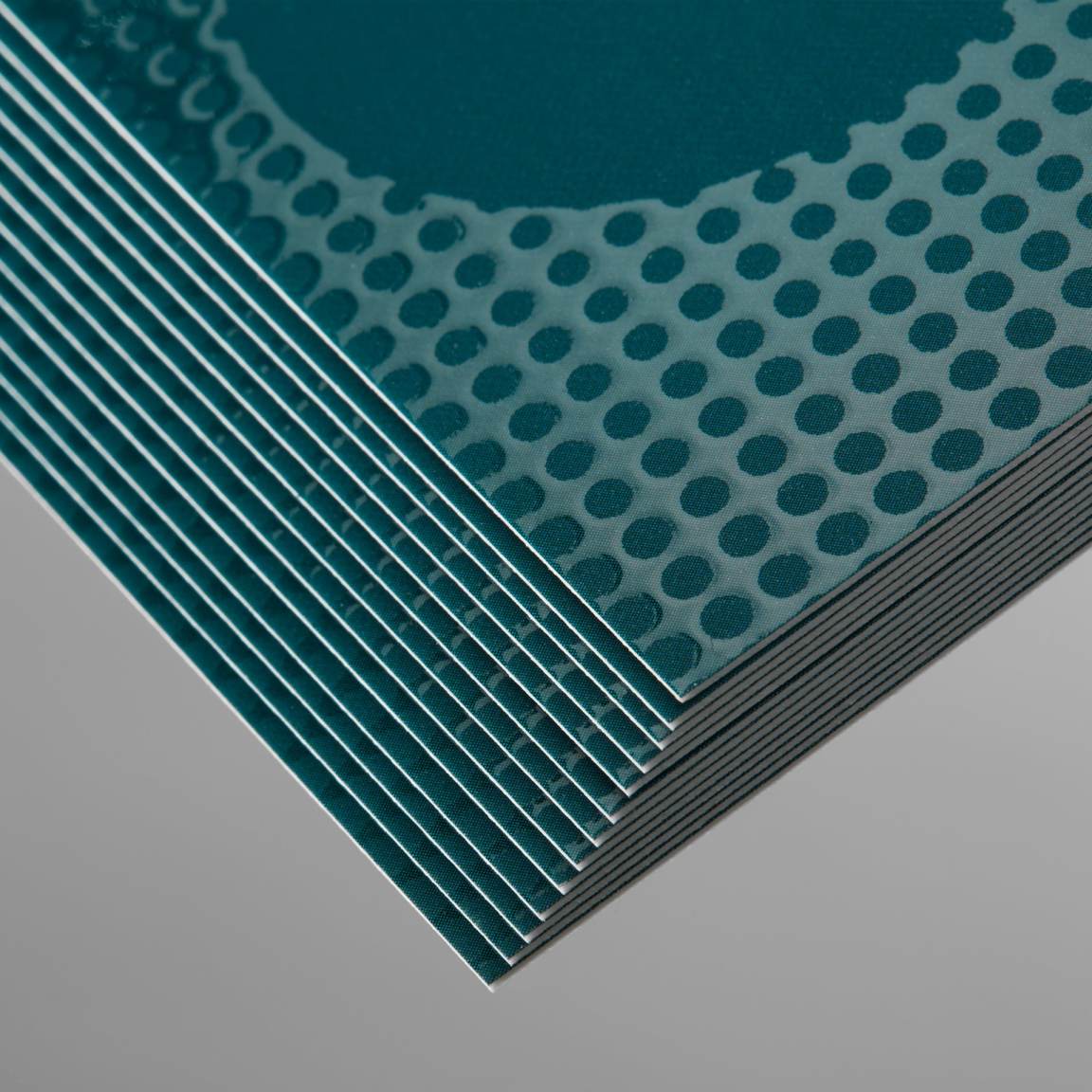
Two words: high quality. If you’re ready and willing to get your brand to a point where it stands out amongst the crowd, then letterpress is the way to go. Your design is printed on paper using a letterpress machine, which presses the ink through the screen and onto the paper below, and it just looks so refined when it comes out the other side.
It’s a really satisfying, crisp effect that you rarely get from other business card designs. If you want to keep things cheap and cheerful, then you can always take your chances elsewhere, but this is all about considering the long-term instead of the short-term.

It’s posh, it’s luxurious, and it may even be over the top in the eyes of some, but foil printing (especially in gold and silver) can be wonderful. The process uses heat and a solid foil colour to press your design into the card stock with the opaque foil making for a really nice, metallic finish that comes sprinting off of the page in all the best ways.
You can also go for a hologram type of effect, and even though some would see that as overkill, it really depends on what kind of business you’re trying to put out there. Sometimes, you need to make some noise by being a bit alternative, and there are few better ways to do that in this game than through foil business cards - and you can trust us on that.
Spot gloss, or spot UV, is a coating that is applied to the top of your business card that highlights certain areas that you want to “pop”. With this option, you’ll be able to see the main headlines from a mile away, and we think this is the kind of finishing technique that can really be quite useful if oozing class is the vibe you’re shooting for.
Raised spot gloss, as you’ve probably guessed by now, gives the highlighted areas in question the ability to physically come off the business card. This, in our view, immediately adds a sense of prestige to your card that others wouldn’t have. If the market is competitive, this is bound to be a method that sticks in the minds of your potential customers.

It’s time to take a little peek behind the curtain and have a glance at some artwork guidelines that would tend to be utilised when creating a business card. Firstly, upon creation, the ideal size tends to be 85mm x 55mm, as we’ve already noted - with 88mm x 59mm being seen as the “bleed area”. Essentially, the goal is to ensure there are no white edges when the business card is trimmed down.
The “safe area” is where you want to put all of the bells and whistles that make up the card. This includes the text, logo and any other pieces of artwork that are used. If images are involved, ensure to save them to the highest possible quality if you’re going to go ahead and use them, if only to make sure there are no complications in the print.
These guidelines are what we’d follow if you were working alongside a company such as Moo.com, which is the example we’ve used here.
In the present day, it feels like graphic design’s sphere of influence has gotten bigger and bigger. From business cards to posters and beyond, everything from the physical to the digital is being transformed into something new. Here at Hatchly, we’re all about adapting, and we’re all about helping you, the customer.
Through our unlimited graphic design platform, we aim to provide as much assistance as we possibly can for whatever needs you may have. With a committed team of professionals behind us, we are able to give you the kind of care and attention needed to take your business to a whole new level.
With affordable pricing and a growing portfolio, we’re ready to take things to the next step - and if you are too, feel free to check out our website and get in touch!