We all love a good flyer, right? They get you thinking, they can open your mind up to new possibilities, and they don’t take up too much of your precious time. A great flyer can put a smile on your face no matter the situation, and that’s all we ever want in a good piece of advertising or marketing. So, what’s the secret behind the success?
There’s no ‘one solution’, as it were. There are endless ways in which you can make the flyer as good as it can possibly be. Today, the aim of the game from our point of view is to peel back the curtain and give you a glimpse into what it takes to reach that next level.
Spoiler: With some grafting and dedication, the one idea that will revolutionise your business could be right around the corner.
If you’re sitting contemplating the point of flyers and why exactly they should be seen as relevant in the modern day, we don’t blame you. After all, it’s so easy to dismiss the old way of doing things in a modern society. At the same time, we do believe there are plenty of reasons why they still serve a real purpose as the world continues to change and develop in these crazy times.
Flyers can be a great way to promote the service, product or company you’re trying to get out here, mainly because it’s so social. From picking one up in a shop to being handed a flyer in a street, there’s something appealing about an item that’s small but easy to digest. The formula to success, in reality, really isn’t that complicated.
You can reach a broader audience and even pick up new customers. Flyers are affordable, they can catch the eye based on their design, and they’re pretty easy to produce once you’ve got the manufacturing sorted. Whether you’re trying to get the word out locally or you’re heading to the big city, there are so many ways to make this work.
We aren’t planning on taking you on a ‘step-by-step’ journey here, but instead, we want to highlight some of the big areas you’ll want to focus on when you’re in the trenches making your design. Many of these points may come across as being a bit too obvious here or there, but they are all essential - because when considering how to design a flyer, you can never be too careful.
When you’re in the planning phase of sorting out your flyer, you must think about where everything is going (yes, we understand how simplistic that sounds). If you’re using a variety of different elements to make up your flyer, then it can be easy for things to get a bit confusing or overbearing. What you want to do is make it as visibly stimulating for the audience as possible.
When you’re setting out your mission statement, map out a few different ideas for the layout based on the dimensions and the product you’re trying to sell. When it comes to actually stringing every piece of the puzzle together, you’d be surprised by how many times a designer can be caught off guard by the measurements not being quite right for the desired layout.
Every font has a different vibe and creates a different atmosphere for the design you’re trying to put forward, and that much is obvious. The typography you want to go for will, ideally, align with your business values as best as possible. It may seem easier to simply hop on Microsoft Word and pick the first font you see, but you’d be doing yourself a massive disservice - if only because that feels pretty cheap and lazy.
First, you need to decide what the primary font will look like. It needs to have strong readability, one or two unique design aspects, and a clear understanding of its role in your flyer. If you go too far in one direction, you can come off as dull, but if you move too far in the other, you can end up with a tacky product, and neither are ideal outcomes.
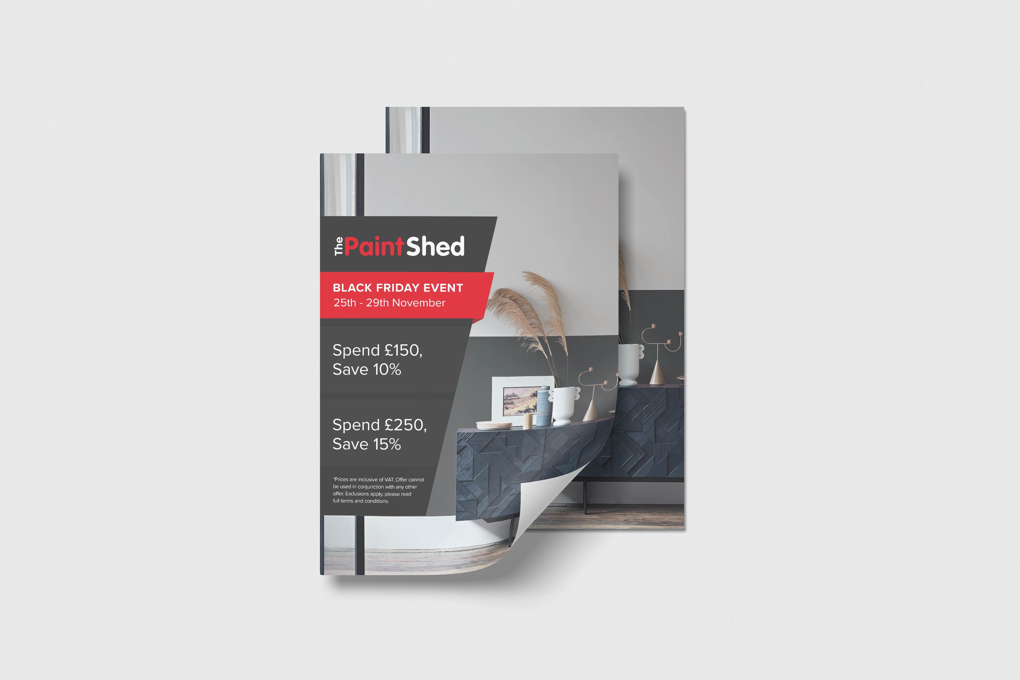
The colour scheme of any flyer is important to consider, and before you can even get to the colours involved in the font, you need to think about the background. We’ve spoken at length before regarding the colour wheel and how different combinations can make you feel warm and safe, whereas others can leave you slightly on edge or could feel more mysterious.
Once again, this all goes back to understanding the tone and figuring out what your end goal really is. There’s a wide palette out there, and we know how tempting it can be to sample too many different options simultaneously. Alas, the best course of action would be to pick between one and three main colour sources and stick to them throughout the entire flyer.
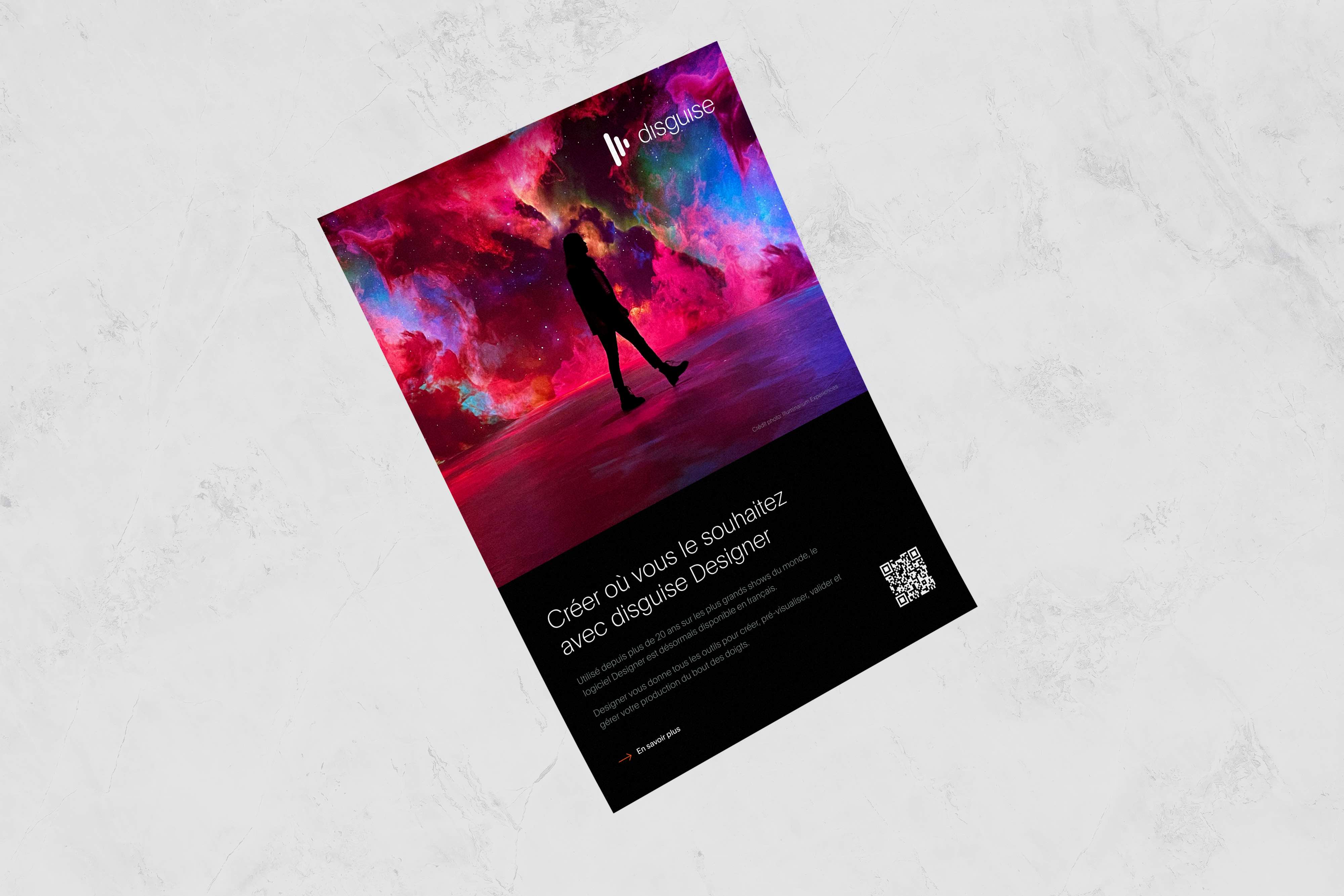
Using imagery in a flyer is an interesting concept, but doing it correctly can be tricky. Yes, images can be perfect if you want to convey an emotion or provide an example of the product you’re selling. At the same time, they can completely take over the flyer to the point where it may be pulling attention away from the other elements.
If the images are too small, they may as well not even be there - as if it’s a poorly executed newspaper strip. It’s a fine balance you need to strike, and it’s not a talent that comes overnight. You need to have a solid team around you who are willing to give honest, constructive feedback that’s going to elevate the flyer and make it feel relatable.
The beauty of visual hierarchy is that it gives your work purpose. It is, essentially, the way in which you arrange elements of your piece in order of their importance. It gives the audience an opportunity to digest things in a certain way, and it makes everything feel a whole lot neater. Everyone will see the hierarchy and know what to prioritise - or, at least, that’s the hope.
You’re adding structure into the mix, and with that comes an added sense of professionalism (well, at least in our view, it does). If there are so many different ideas flying around that you can’t differentiate between them, it can be a bit of a logistical nightmare to work your way through it all. Pick out an order, rank what you’ve got, and adjust accordingly.
All flyers have different dimensions and sizes - and for good reason. What works for one may not work for another, and, to put it simply, you have first to consider what kind of message you’re trying to get across. In terms of the most popular sizes, you tend to see the following: letter size (8.5” x 11”), half page (5.5” x 8.5”), quarter page (4.25” x 5.5”) and rack card (3.5” x 8.5”).
A letter size gives you much more space and falls under the “bigger is better” line of thinking. A half page pushes you to utilise your space more, and we’d say it’s the flyer we tend to see shooting through our postbox more often than most. The quarter page is easier to hold but demands a concise form of communication, whereas the rack card is all about high-impact, intense graphic design.
They all have their pros and cons, but picking the size is something you need to be doing pretty early on in the process. Once you’ve ironed out the details of what you want to include, you need to figure out the logistics, which is where the dimensions come into play.
There are plenty of tips and tricks out there for you to dive into when it comes to flyer design, but we thought it’d be handy to think of a few that spring to mind. It may seem like a standard practice to develop a flyer and get it out there for the world to see, but you’d be surprised at how many folks seem to fall at the first hurdle.
The phrase ‘target audience’ is one that’s been thrown around on more than a few occasions in the design realm over the course of the last few decades, and for good reason. When you are setting up any kind of visual art, one of the first things you need to establish is the target audience. Who is this piece for, and what are you going to do in order to draw them in?
Yes, it can be a bit broader than that if you’re trying to appeal to a wider spectrum of people, but that isn’t always the easiest thing to do. If you’re advertising a brand-new skatepark, an older age bracket probably isn’t what you want to shoot for. In equal measure, the opening of the latest museum in town will probably cater to a specific kind of spectator.
This one sounds really boring, and it’ll probably seem like it when we read this back, but we have to touch on it. The difference between a high-quality printer and one that’s distinctly average is vast, and it can be pretty damning when you look at the finished product. You’ll want your work to seem confident in itself, and if it looks cheap, you will fall at the first hurdle.
This is probably going to require some more investment but so long as you make the right budget beforehand, it shouldn’t be a problem. It’d be such a shame if you put all of the work in on a screen, only for the project to slowly collapse in on itself once you have it in your hand. You need to test, test and test it again, and only then can you feel confident in beginning your distribution chain.
It should go without saying, but you can’t just start handing out flyers without any kind of feasible game plan. Well, you can, but it probably isn’t going to go well. If you’re going onto the streets to get the public interested, think about your timing. When will you have a large volume of potential customers on the streets? Is it a weekday? What are the prime hours for activity in the region?
Beyond that, there needs to be an active distribution method. You could keep a stack of flyers in an area with high traffic, you could deliver them door-to-door, or perhaps you’d be better off putting them in a variety of different shops and stores across the town or city. If you build the right team, if you time block, and if you mobilise, then the dominoes will begin to fall.
We can understand that for many folks, even designing a flyer can bring on a migraine or increase your stress levels tenfold. Thankfully, it doesn’t have to be that way.
Here at Hatchly, we function with an unlimited graphic design service that gives you all the tools you need to succeed as a business. We can offer you a team of committed, dedicated professionals who are ready to take on as much work as you’re willing to throw at them. It’s cost-effective, there’s a great line of communication, and it gives you one less thing to worry about.
Investing in graphic design may not seem like a big deal, but for the longevity of your company, it can be really critical to consider the positive effects it can have. So, if you’re interested in learning more, please check out our website — and if you have any questions, feel free to get in touch!